
A print of everywhere that made you
Every postcode is a map of a life. The street you grew up on. The park you walked the dog round. The pub that became “the usual.” The corner where the bus always made you run.
Pitchabode takes a UK postcode and turns every place name inside it into a single piece of typographic word art — set in the kind of type you’d find on a Penguin spine or a London Underground sign. No clip art, no filler. Just the names, beautifully arranged.
We live in a world that reaches for a photograph for everything. But a photo shows you one moment from one angle. A name holds the whole thing — every walk, every winter, every “see you at the usual.” Words do the remembering that pictures can’t. That’s why every Pitchabode is built from them, and nothing else.
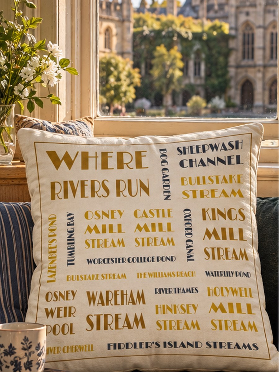
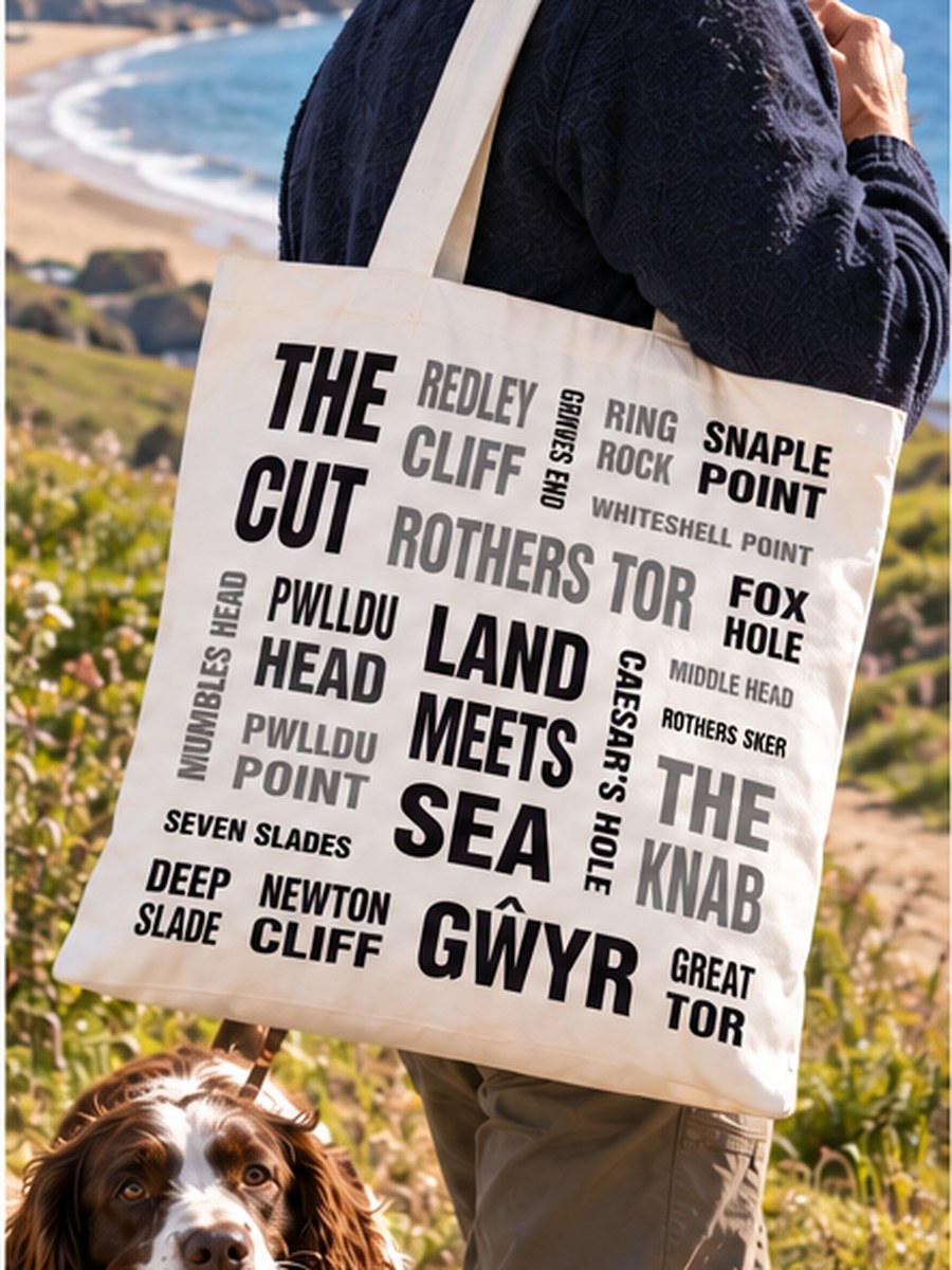
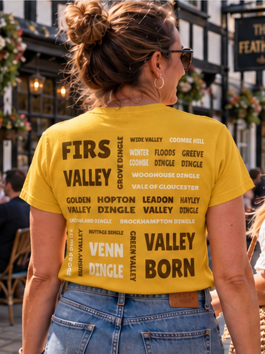
Why it started
I wanted to buy someone something personal and kept hitting the same wall: flowers, chocolates, the usual. Nothing that said anything about the person. And the thing I kept coming back to was place — how much where we live matters to us, how much “home” carries, and how a postcode has quietly become the shorthand for all of it. So the idea was simple. Put a postcode in, and get back the names of everything around it.
How it grew
The first version worked on the first half of a postcode — the district. It was good, but people wanted closer than that. They wanted their street, not their area. So we rebuilt it around the full postcode, searching outwards from that exact point, and it changed everything: the castles, the rivers, the woods, the pubs, the landmarks that are genuinely yours rather than roughly nearby. Now it can find what’s around anybody, wherever they are. It’s just what’s there.
The places
Every one of these has a postcode. So does your street, your local, the field you walk the dog in. That’s all a Pitchabode is — the names that are already there.
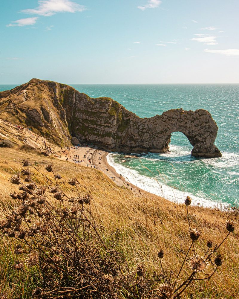 Durdle DoorBH20
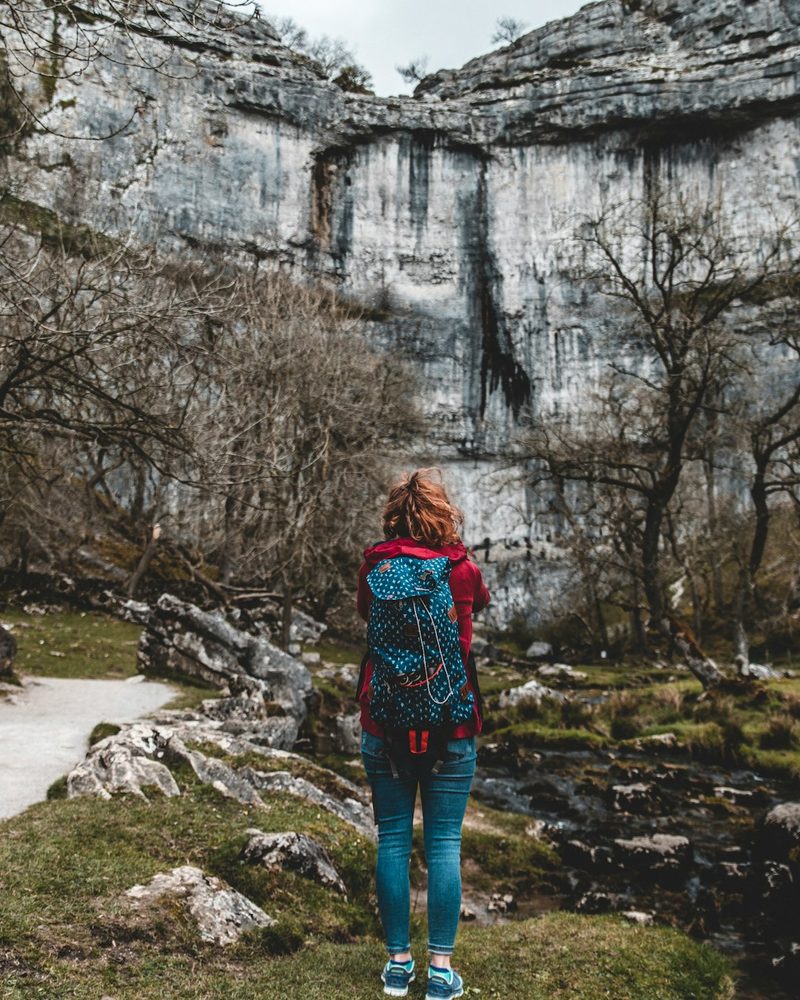 Malham CoveBD23
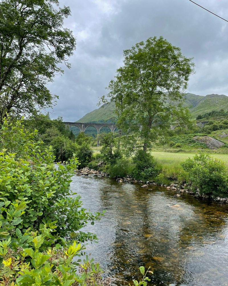 Glenfinnan ViaductPH37
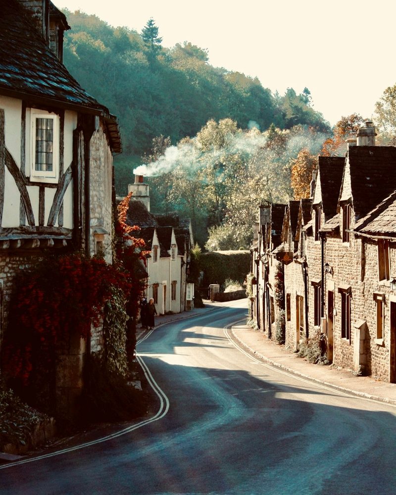 Castle CombeSN14
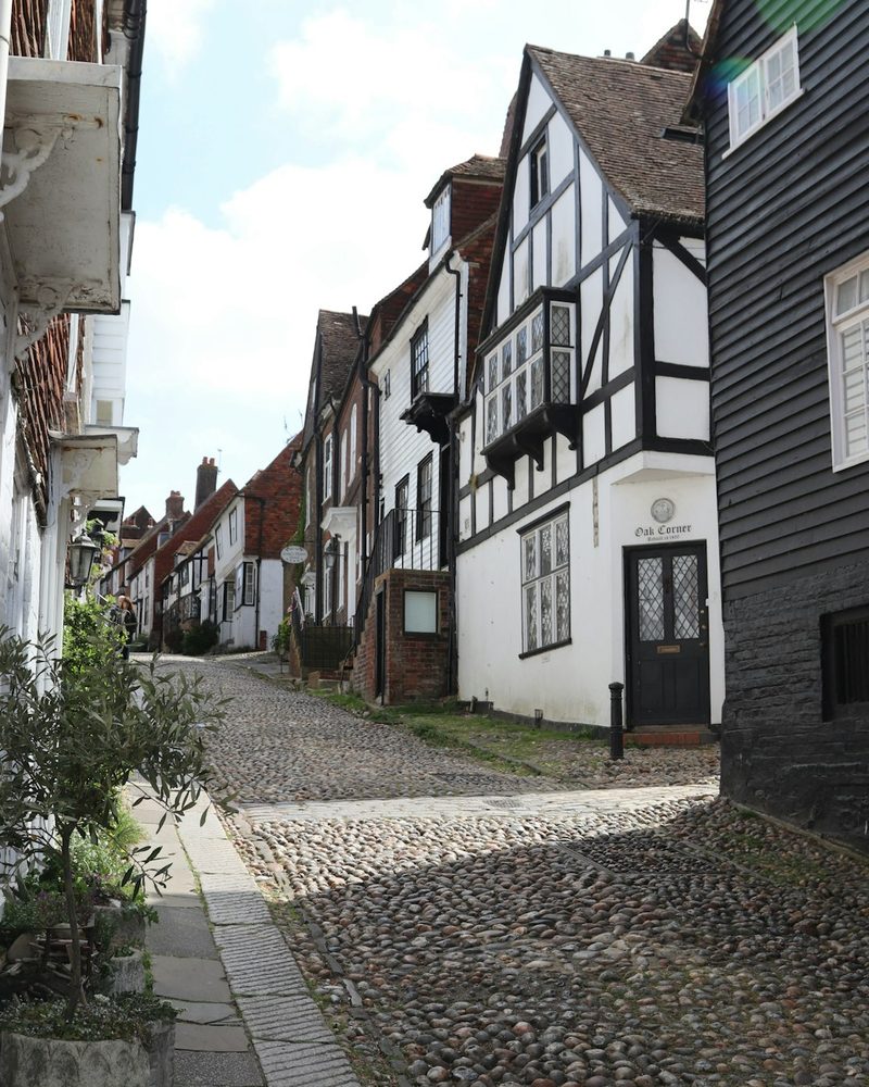 Mermaid Street, RyeTN31
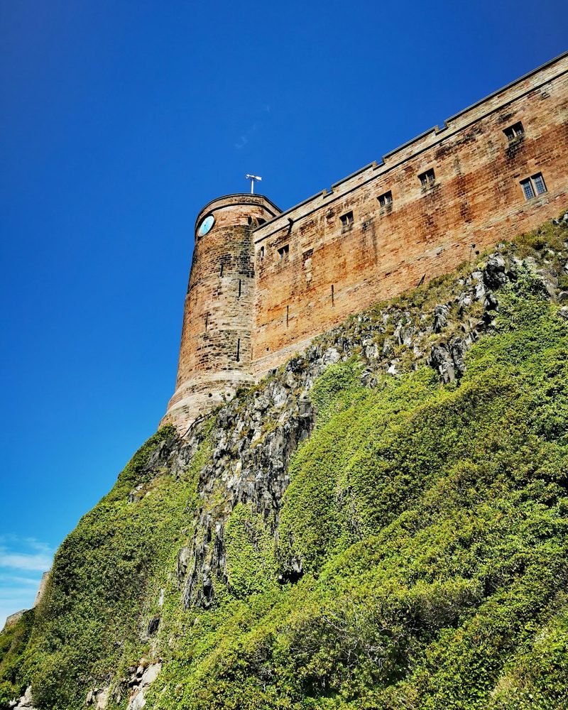 Bamburgh CastleNE69
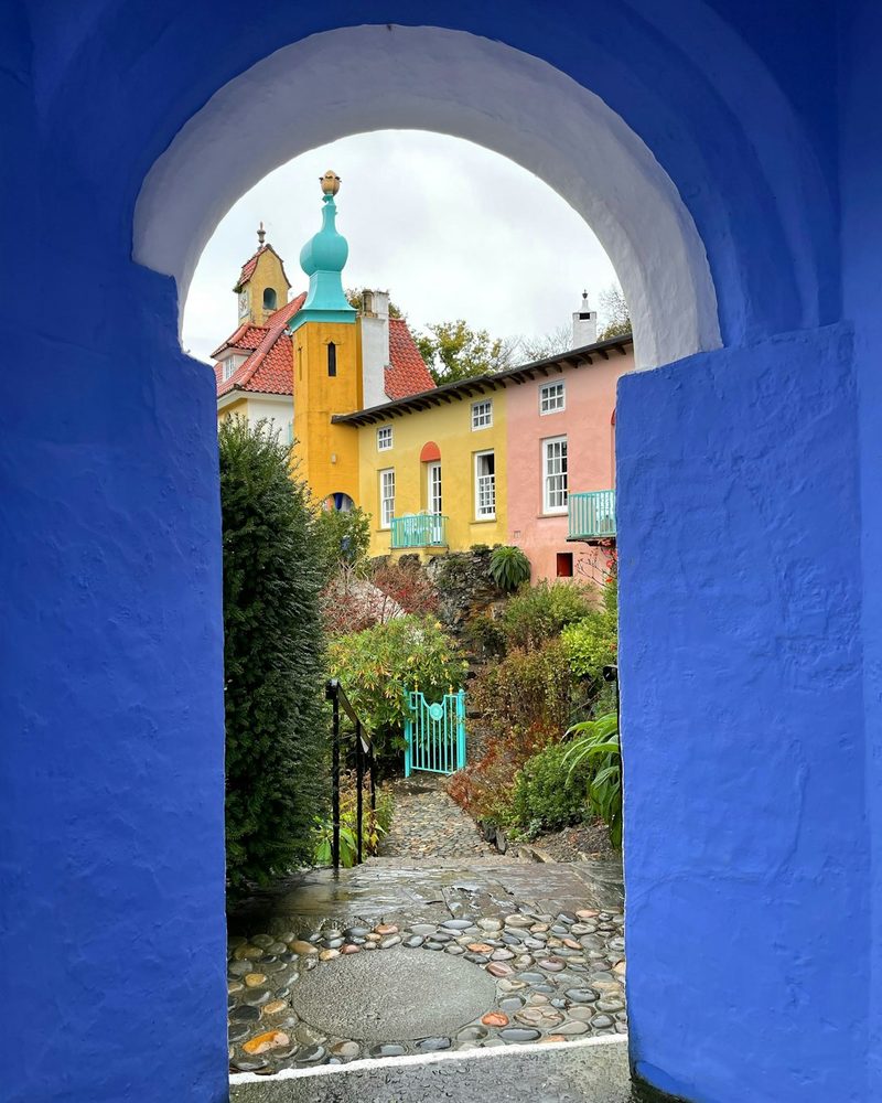 PortmeirionLL48
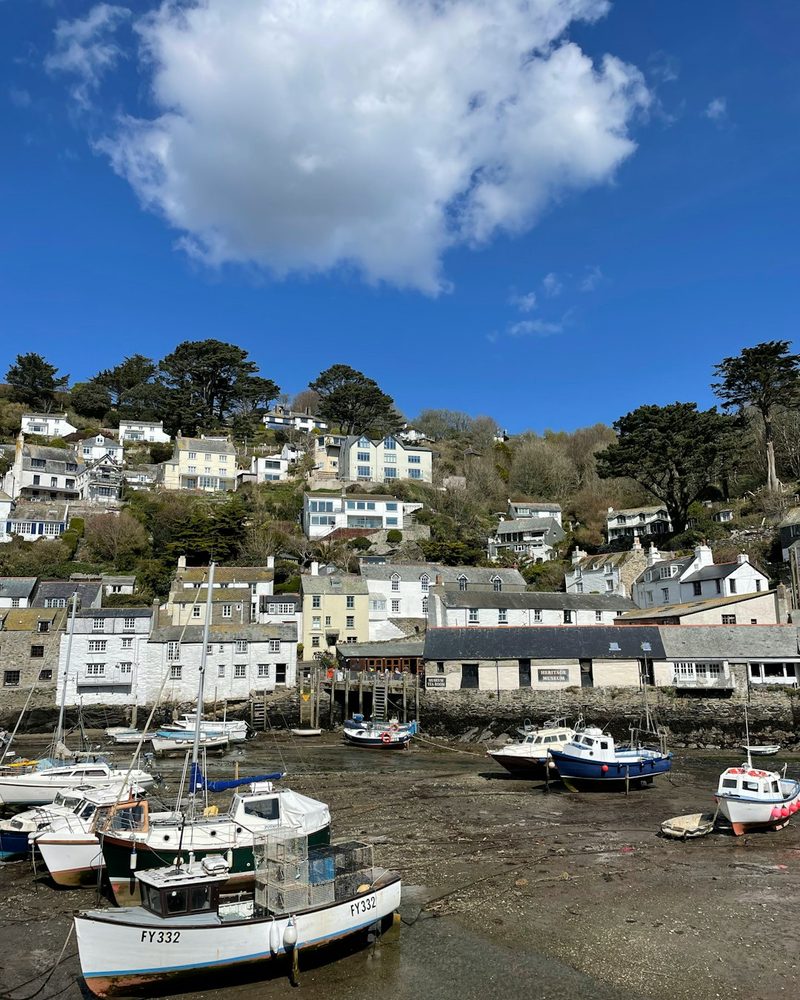 PolperroPL13
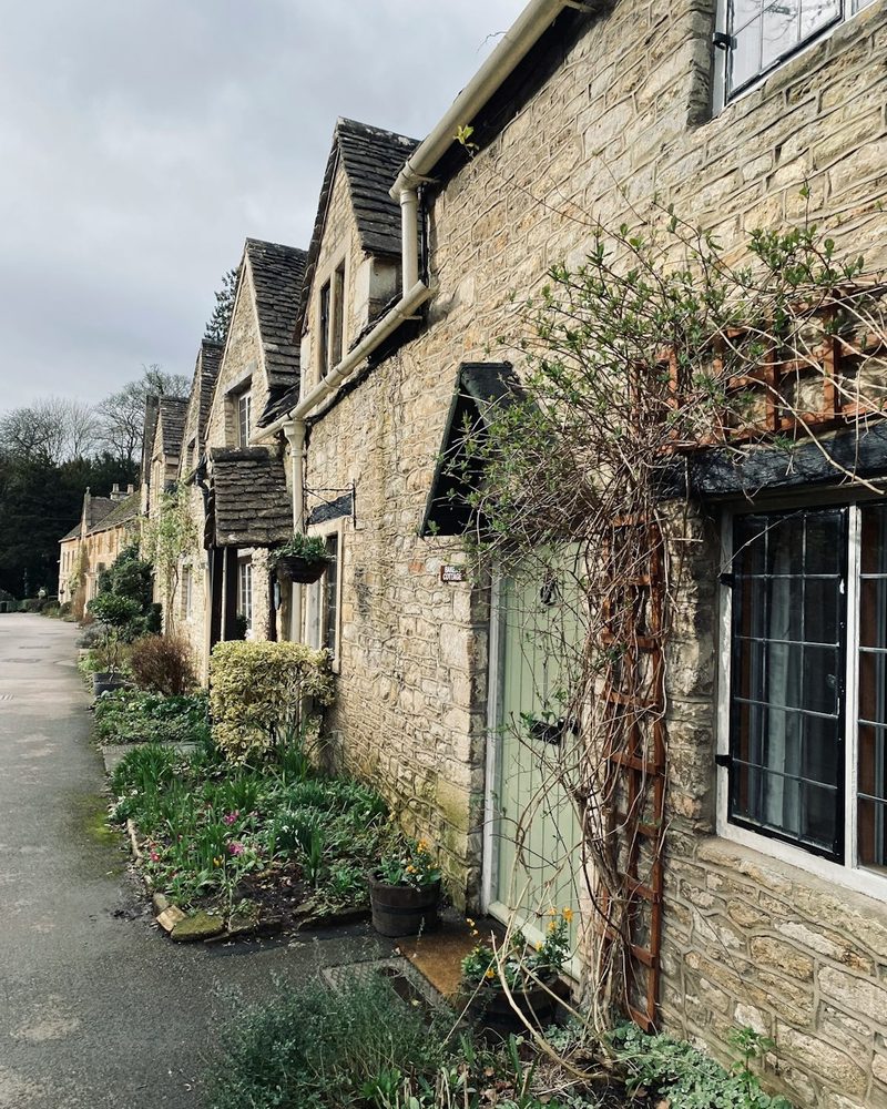 BiburyGL7
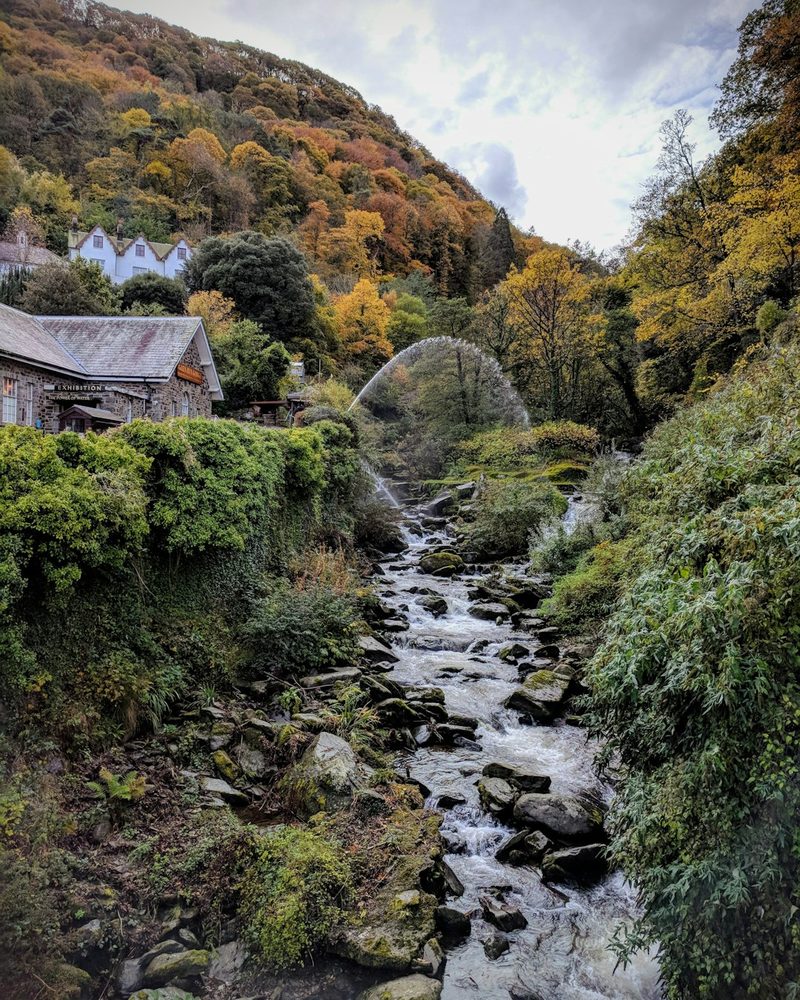 LynmouthEX35
Why words
We live in a world full of images, and more of them are made by machines every day. This business uses that technology too — it would be dishonest to pretend otherwise. But a photograph shows one moment from one angle, and then it’s finished. A name doesn’t work like that.
“Smugglers’ Hole.” “Banter and Beer.” “Where Rivers Run.”
Read the names of the places around you and you get every walk, every winter, every time you said “see you at the usual” — the whole thing, not one second of it. Britain’s place names are extraordinary, and they’re worth keeping hold of. That’s what this is: the words, beautifully arranged, and nothing else.
How it’s made
On paper. Heavyweight 200gsm art paper, printed to order in four sizes — 30×30cm, 40×40cm, A3 and A2 — and sent framed or unframed. Framed prints come in a single clean classic frame with a Perspex glaze and no mount, in eight frame colours, so the type is the only thing doing the talking.
On cloth. The t-shirt is a 180gsm organic ringspun combed cotton crew neck, GOTS certified, printed across the back in water-based vegan inks, in sizes S to 3XL. The tote is a Stanley/Stella Mid Tote in 220gsm 100% recycled cotton canvas, with a 300 × 300mm print on the front. Both are printed here in the UK.
For the sofa. An 18-inch square faux linen cushion, printed on the front and made up complete with its pad.
Or just the file. If you’d rather print it yourself, or frame it somewhere of your own choosing, your design is available as a high-resolution digital download.
Every one of them is made only once you’ve ordered it. No mass stock, no warehouse, no box of unsold postcodes — your place is set, printed and sent for you. Delivery is included in the price, on everything.
Pitchabode is a small independent studio based in the UK.